Board Game Night!
Designing for physical spaces
We live in a world where technology has soon found its way into every activity, event and
experience. We use technology in our everyday life to organize, support, activate, engage and so
much more. How these technologies are designed and shaped to either fit into our world, or
disrupt it, is part of the designer’s job.
The Project
The problem-area was defined during the UX specialization at ITU. The case revolved around finding an area of interest where structured leisure activities took place. We were then to examine the current situation and identify one or more existing issues, which we could then solve or assist in through a screen-based solution. The board game night at ITU was subsequently chosen as it was a readily availbe leisurely activity with easy access to testing and participants.
The Problem
Through the data several problem areas were identified, which had the possibility
to be improved through a screen-based solution. One particular issue seemed more prominent
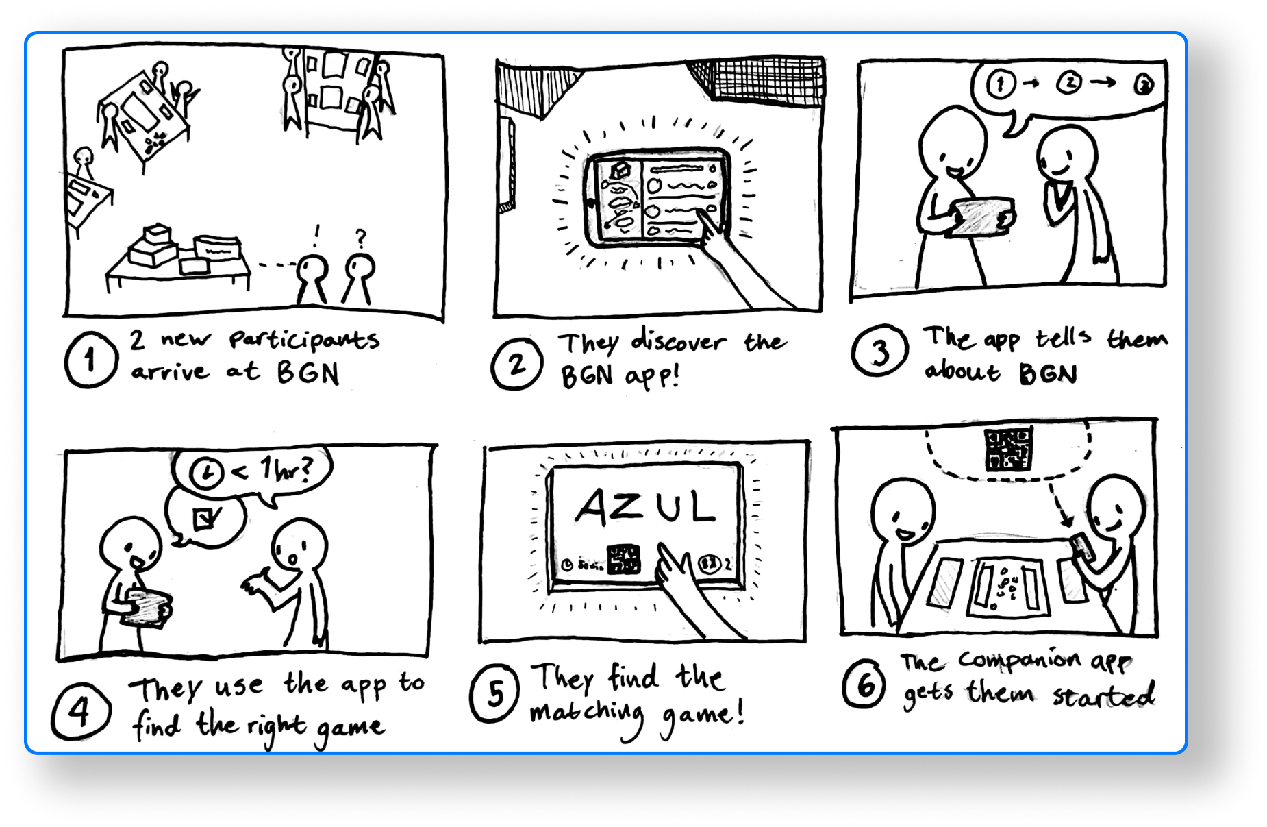
than the others: The lack of facilitation and guidance at the event. It was found that new participants
would be hesitant and unsure about the customs and allowed actions at board game night. We also found the
regular participants could benefit from additional guidance in regards to the board games themselves, and their mechanics.
The Solution
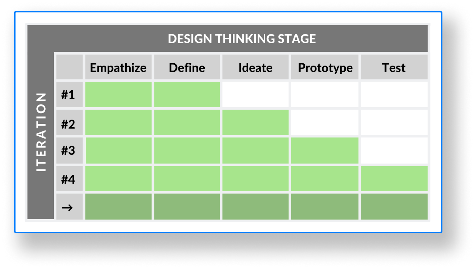
Throughout the process a myriad of methods were used. The overall process followed the design thinking stages, and went through multiple iterations of each stage.
At the core of the usability work was Nielsen’s 10 heuristics, which describes the empirically derived most common usability problems. By considering these when designing a digital artifact, a lot of usability issues can be mitigated. Among these principles most of the uncovered problems were the following:
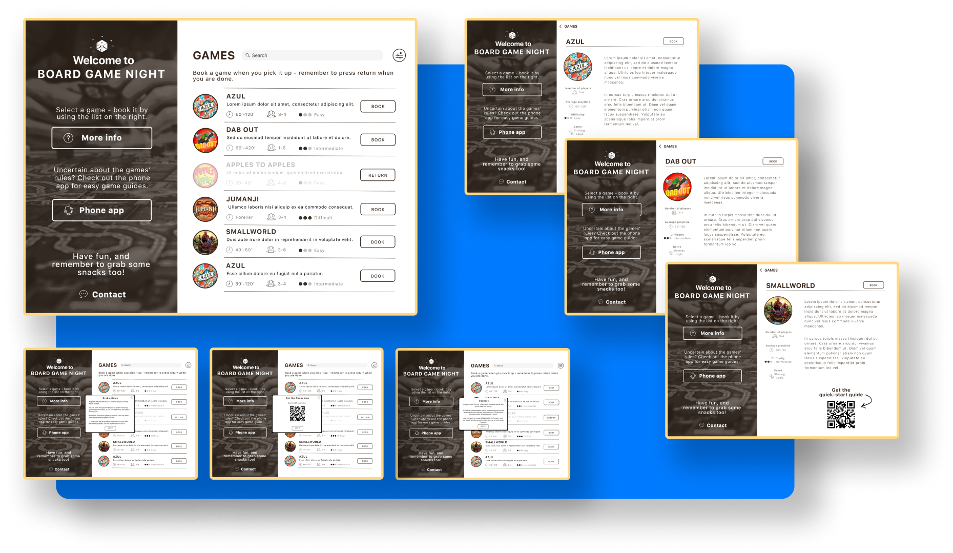
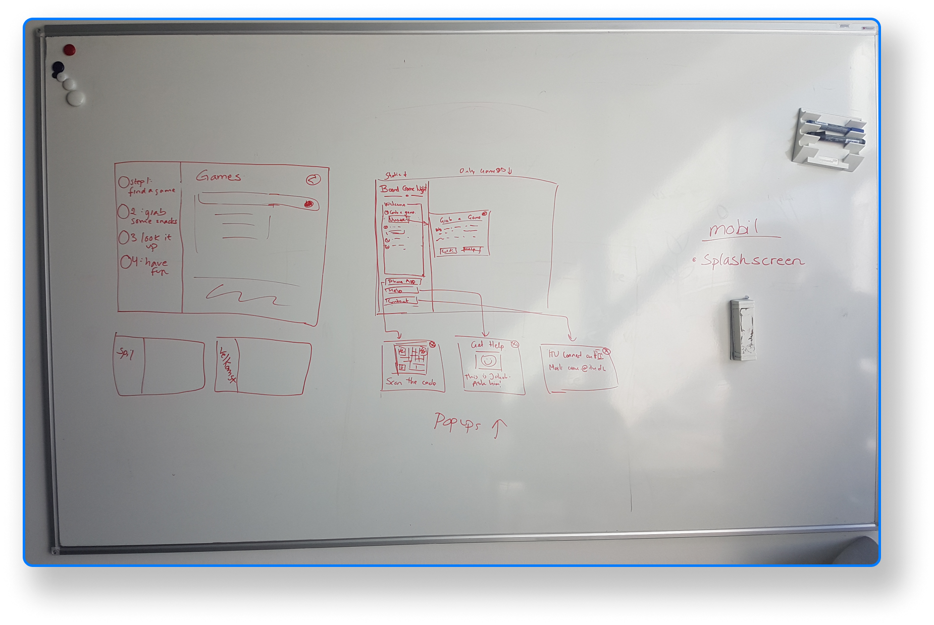
- The heuristic of “help and documentation”, as the app is designed as a piece of documentation for the event itself. This is the motivation behind making the left sidebar static to ensure that there is always help available for the user. Clicking on the buttons in the sidebar will provide the user with further explanations through dialogue boxes.
- Additionally, we were concerned with the heuristic of “error prevention”. The app should be designed both in a way that lets user recover from errors smoothly (as per the “error recovery” heuristic), but naturally, it is preferable if you can design the layout in such a way so that the errors do not occur in the first place. Specifically, ealier iterations of the prototype allowed one-click booking of games however it was found that this, given the nature of the event, allowed people to accidentally book games. This was mitigated by adding a ‘confirm booking’ option.
- In accordance with the “Consistency and standards”-heuristic, it was chosen to employ a navigational framework that the user would be familiar with. We chose to work with Apple’s hierarchical navigation guidelines (Apple Inc, n.d.). This mean that the user makes one choice per screen to navigate forwards or backwards.
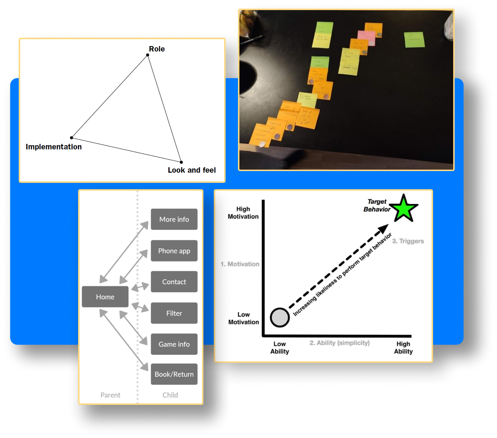
As the project revolved around people in their leisure time, it was deemed important for the app to be
persuasive, in order for the potential users to both want to and be able to engage with the concept.
Therefore it was found to be useful to utilize Foggs behavior model during the Ideation stage, to assist in iterating and building upon the ideas with specific regards to how one could enhance both ability and
motivation in the potential user group. As described above, various measures were taken to ensure a high level of ability.
Naturally, though, the steps mentioned above taken to improve usability would be
redundant if the user never interacts with the app. As the app is intended to be displayed on a
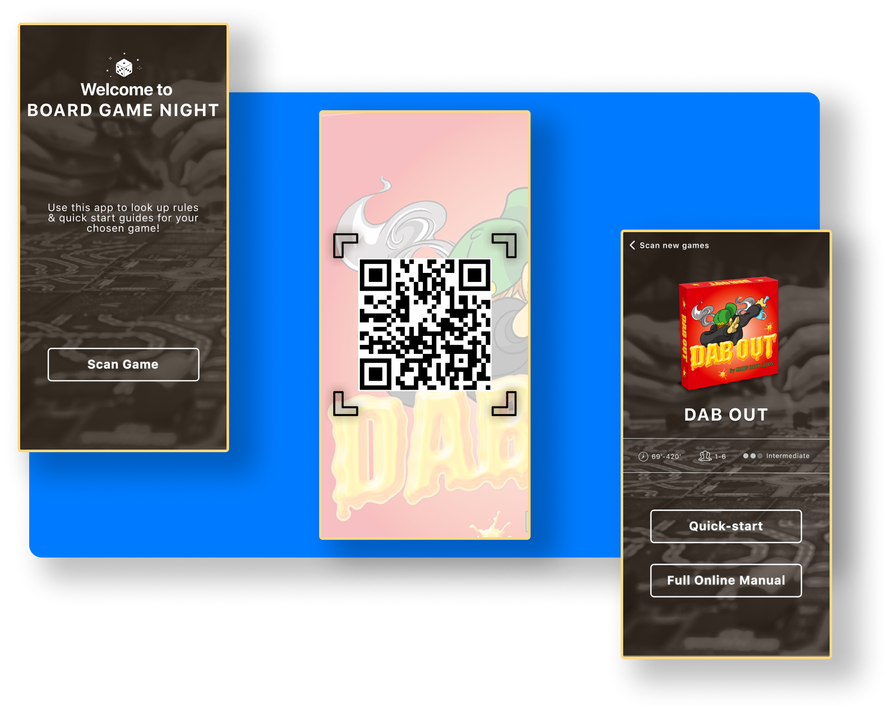
shared tablet, accessible by all attending board game night, it might be occupied at times where multiple users wants to access it. Because of this it was chosen to move some of the functionality - the quick-start
guide and rulesets - to a smartphone-accessible web app. As these are functionalities that might
take longer for the individual user to interact and consult with, we wanted to increase the ability
to use the functions (and also freeing up space to use the “shared” tablet), by moving these
functionalities unto multiple personal devices at the same time.
The Final Prototype
To evaluate the prototype, we made use of methods from each of the three categories of evaluation from “Interaction Design: Beyond Human-Computer Interaction” these being “Controlled settings involving users”, “Natural settings involving users” and “Any setting not involving users”. All three methods were intended as formative evaluations.
The first of the three evaluations, “Natural settings involving users”, was based on an in- situ evaluation, meant to evaluate the situated user experience by testing the prototype in the users’ context, i.e. at the board game night. Here, a prototype was present at the event in the context of its intended use, with facilitators present to prompt interaction with the prototype and address potential questions, while notetakers observed and documented findings.
Additionally, we made use of an “expert test” in the form of a heuristic evaluation, adhering to the “Any setting not involving users” category. A heuristic evaluation assesses an interface based on a set of agreed-upon best practices for usability.
The final method, from the “Controlled settings involving users” category, was structured around a focus group interview, supplemented by a roleplay-inspired exercise to base the discussion on. The focus group consists of a small group of select individuals that, guided by a moderator, provide insights into the given issue.
